Bootstrap Button Group
Overview
The button features coupled with the hyperlinks wrapped inside them are perhaps the most important features helping the users to interact with the web pages and take various actions and move from one webpage to some other. Specifically these days in the mobile first industry when about half of the webpages are being viewed from small-sized touch screen machines the large convenient rectangle zones on screen simple to find with your eyes and tap with your finger are more necessary than ever. That's the reason why the brand-new Bootstrap 4 framework advanced providing extra convenient experience dropping the extra small button size and adding some more free space around the button's subtitles to get them more easy and legible to use. A small touch bring in a lot to the friendlier looks of the brand new Bootstrap Button Group are also just a little more rounded corners which coupled with the more free space around helping make the buttons a whole lot more pleasing for the eye.
The semantic classes of Bootstrap Button Change
For this version that have the very same amount of very easy and great to use semantic styles giving us the feature to relay indicating to the buttons we use with simply just incorporating a single class.
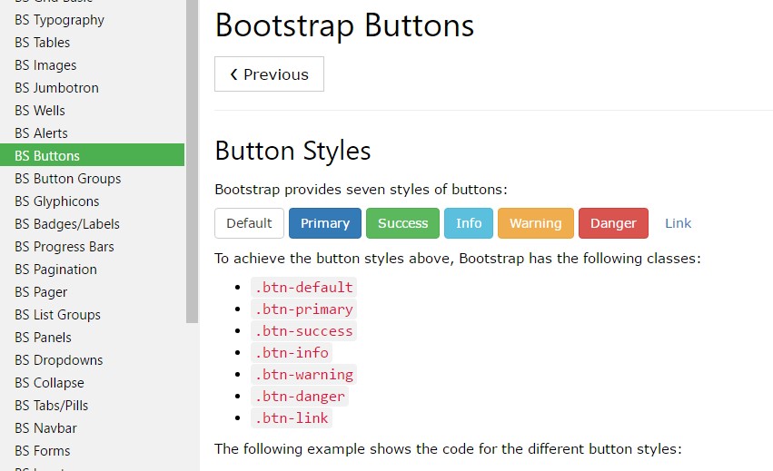
The semantic classes are the same in number as in the last version still, with some improvements-- the hardly ever used default Bootstrap Button generally having no meaning has been gone down in order to get replaced by even more intuitive and subtle secondary button designing so presently the semantic classes are:
Primary
.btn-primarySecondary
.btn-secondary.btn-default.btn-infoSuccess
.btn-successWarning
.btn-warningDanger
.btn-dangerAnd Link
.btn-linkJust make sure you first add the main
.btn
<button type="button" class="btn btn-primary">Primary</button>

<button type="button" class="btn btn-secondary">Secondary</button>

<button type="button" class="btn btn-success">Success</button>

<button type="button" class="btn btn-info">Info</button>

<button type="button" class="btn btn-warning">Warning</button>

<button type="button" class="btn btn-danger">Danger</button>

<button type="button" class="btn btn-link">Link</button>
Tags of the buttons
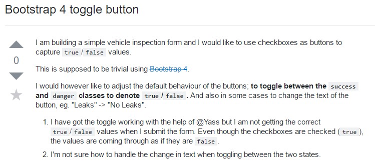
The
.btn<button><a><input><a>role="button"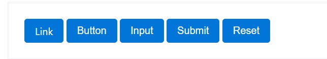
<a class="btn btn-primary" href="#" role="button">Link</a>
<button class="btn btn-primary" type="submit">Button</button>
<input class="btn btn-primary" type="button" value="Input">
<input class="btn btn-primary" type="submit" value="Submit">
<input class="btn btn-primary" type="reset" value="Reset">
These are however the part of the achievable looks you are able to enhance your buttons in Bootstrap 4 ever since the brand-new version of the framework also gives us a brand new suggestive and beautiful way to style our buttons holding the semantic we just have-- the outline setting ( recommended reading).
The outline mode
The solid background without any border gets replaced by an outline along with some text with the related colour. Refining the classes is definitely very easy-- just provide
outlineOutlined Leading button comes to be
.btn-outline-primaryOutlined Second -
.btn-outline-secondaryImportant factor to note here is there is no such thing as outlined link button in such manner the outlined buttons are in fact six, not seven .
Reinstate the default modifier classes with the
.btn-outline-*
<button type="button" class="btn btn-outline-primary">Primary</button>
<button type="button" class="btn btn-outline-secondary">Secondary</button>
<button type="button" class="btn btn-outline-success">Success</button>
<button type="button" class="btn btn-outline-info">Info</button>
<button type="button" class="btn btn-outline-warning">Warning</button>
<button type="button" class="btn btn-outline-danger">Danger</button>
Extra content
Nevertheless the semantic button classes and outlined visual aspects are certainly wonderful it is crucial to remember just some of the page's guests probably will not actually have the ability to see them in this way in case you do have some a bit more special interpretation you would love to bring in to your buttons-- make sure together with the aesthetic methods you additionally add in a few words describing this to the screen readers hiding them from the webpage with the
. sr-onlyButtons proportions
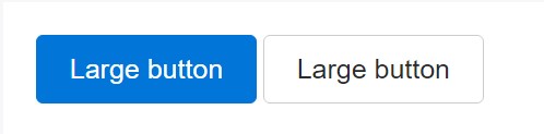
<button type="button" class="btn btn-primary btn-lg">Large button</button>
<button type="button" class="btn btn-secondary btn-lg">Large button</button>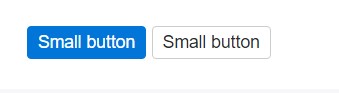
<button type="button" class="btn btn-primary btn-sm">Small button</button>
<button type="button" class="btn btn-secondary btn-sm">Small button</button>
Write block level buttons-- those that span the full width of a parent-- by adding
.btn-block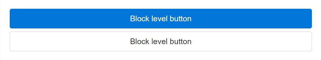
<button type="button" class="btn btn-primary btn-lg btn-block">Block level button</button>
<button type="button" class="btn btn-secondary btn-lg btn-block">Block level button</button>
Active setting
Buttons can show up pressed (with a darker background, darker border, and inset shadow) while active. There's no need to add a class to
<button>. activearia-pressed="true"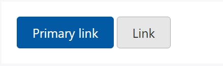
<a href="#" class="btn btn-primary btn-lg active" role="button" aria-pressed="true">Primary link</a>
<a href="#" class="btn btn-secondary btn-lg active" role="button" aria-pressed="true">Link</a>
Disabled mode
Make buttons seem non-active by bring in the
disabled<button>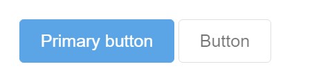
<button type="button" class="btn btn-lg btn-primary" disabled>Primary button</button>
<button type="button" class="btn btn-secondary btn-lg" disabled>Button</button>
Disabled buttons using the
<a>-
<a>.disabled- Some future-friendly styles are featured to turn off all pointer-events on anchor buttons. In web browsers that support that property, you will not find the disabled cursor anyway.
- Disabled buttons must incorporate the
aria-disabled="true"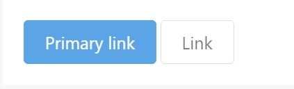
<a href="#" class="btn btn-primary btn-lg disabled" role="button" aria-disabled="true">Primary link</a>
<a href="#" class="btn btn-secondary btn-lg disabled" role="button" aria-disabled="true">Link</a>
Link capability warning
In addition, even in browsers that do support pointer-events: none, keyboard navigation remains unaffected, meaning that sighted keyboard users and users of assistive technologies will still be able to activate these links.
Toggle features

<button type="button" class="btn btn-primary" data-toggle="button" aria-pressed="false" autocomplete="off">
  Single toggle
</button>
A bit more buttons: checkbox plus radio
The checked state for these buttons is only updated via click event on the button.
Take note of that pre-checked buttons require you to manually put in the
.active<label>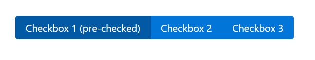
<div class="btn-group" data-toggle="buttons">
  <label class="btn btn-primary active">
    <input type="checkbox" checked autocomplete="off"> Checkbox 1 (pre-checked)
  </label>
  <label class="btn btn-primary">
    <input type="checkbox" autocomplete="off"> Checkbox 2
  </label>
  <label class="btn btn-primary">
    <input type="checkbox" autocomplete="off"> Checkbox 3
  </label>
</div>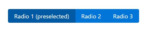
<div class="btn-group" data-toggle="buttons">
  <label class="btn btn-primary active">
    <input type="radio" name="options" id="option1" autocomplete="off" checked> Radio 1 (preselected)
  </label>
  <label class="btn btn-primary">
    <input type="radio" name="options" id="option2" autocomplete="off"> Radio 2
  </label>
  <label class="btn btn-primary">
    <input type="radio" name="options" id="option3" autocomplete="off"> Radio 3
  </label>
</div>
Techniques
$().button('toggle')Conclusions
So primarily in the new version of one of the most favored mobile first framework the buttons advanced directing to get extra sharp, more easy and friendly to work with on smaller sized display and a lot more efficient in expressive methods with the brand-new outlined condition. Now all they need is to be placed in your next great page.
Look at a couple of video training about Bootstrap buttons
Linked topics:
Bootstrap buttons official documentation
W3schools:Bootstrap buttons tutorial
Bootstrap Toggle button